Design for the thumbnail, not the poster: your e-book cover design will be seen at roughly the size of a postage stamp in store searches long before anyone views it full-size. Per KDP's cover guidelines, the ideal ratio is 1.6:1 with at least 1,000 pixels on the longest side — and at that scale, legibility beats beauty every single time.
INKLESS BOOKS publishes information, not legal, financial, or professional advice.
Why does thumbnail readability matter more than beauty?
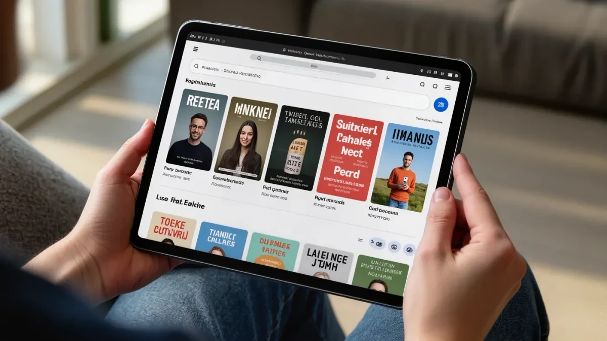
Because the storefront decides for the reader. Category pages, search results, and also-bought carousels all render covers small, and readers scan dozens per minute; a cover that turns into colored mush at that size simply does not get clicked, no matter how gorgeous the full-size version is. The thumbnail is the actual product.
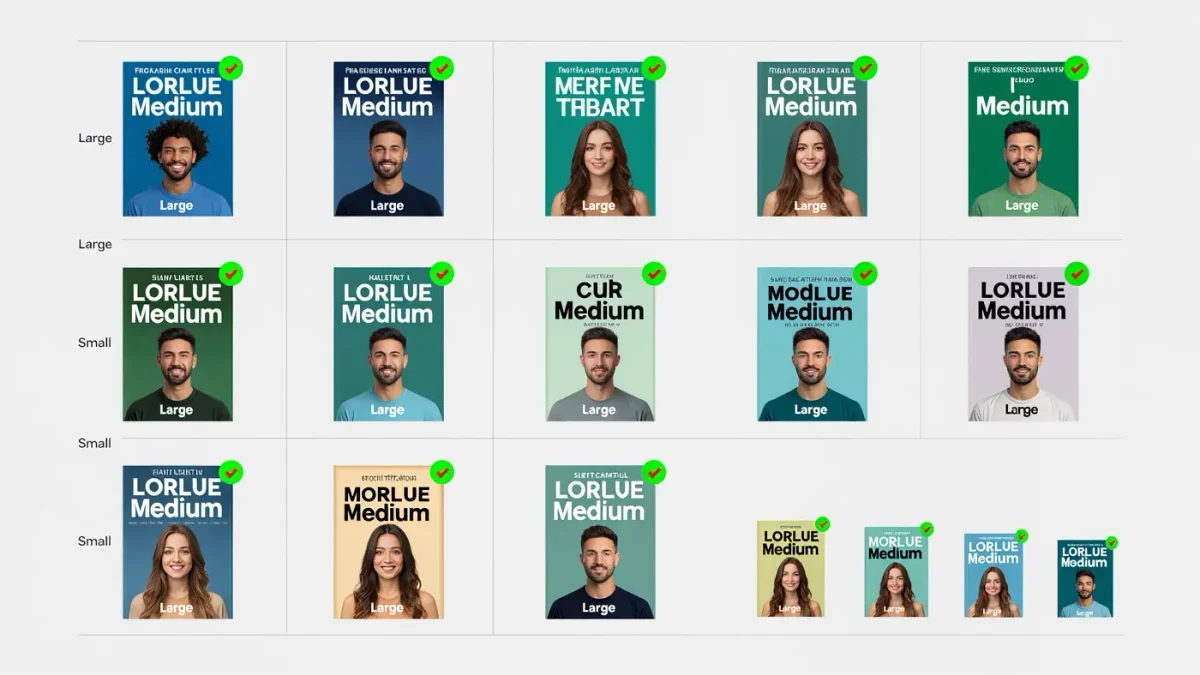
Test yours the cheap way. Export the cover, shrink a copy to about 100 pixels wide, and look at it next to the top twenty titles in your category — or squint at it from across the room, which achieves the same thing with more walking. If the title vanishes, the composition has one focal point too many. Strong thumbnails share a pattern: a single dominant image element, a title in large high-contrast type, and nothing that matters smaller than about a tenth of the cover's height. A breathtaking painting with a whisper of script across the middle is a lovely print for your wall and a terrible store asset. Design downward: make it work at the smallest size first, then let the large version enjoy the leftovers.
What typography keeps a cover legible at small sizes?
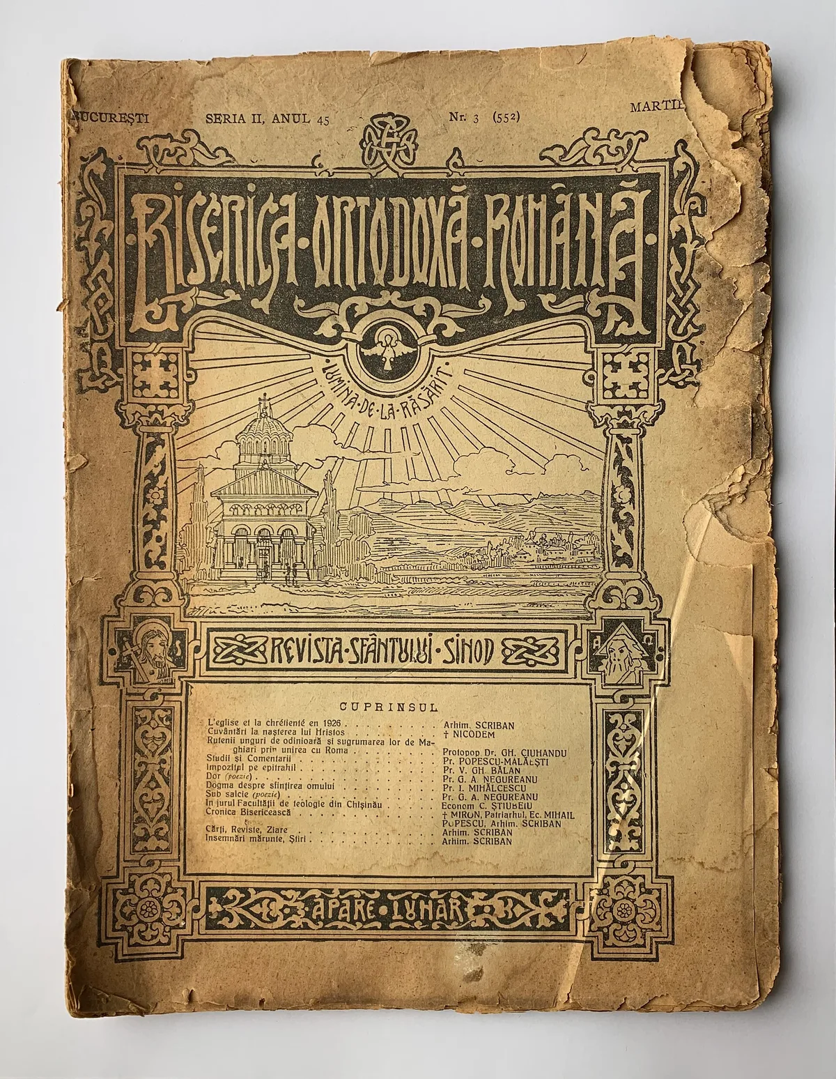
Weight, contrast, and restraint. One bold typeface — thick serif or heavy sans — in a color that clashes hard with the background, sized to fill a third of the cover or more. Two fonts maximum. Any script thin enough to look elegant at full size will evaporate into noise at 100 pixels wide, and nothing announces an amateur faster.
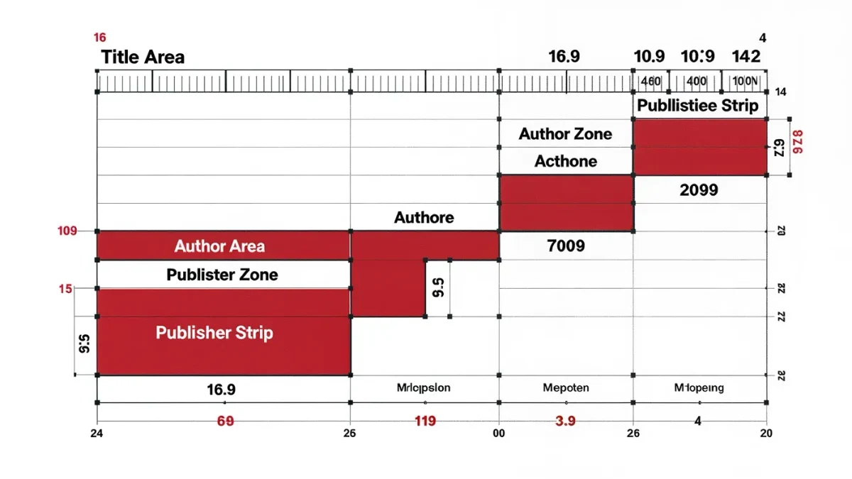
Work through the checklist in order: title in the largest type on the cover; your name smaller unless you sell thousands per title; subtitle tiny or absent; a color pairing with strong value contrast (pale on dark, dark on pale) rather than two similar mid-tones; and effects used sparingly — a subtle stroke or shadow to lift type off a busy background, not a gradient armory. Genre adjusts the recipe: thrillers lean on huge condensed capitals, romance on curvier display faces, nonfiction on clean geometric sans-serifs with a visible promise of benefit. But physics stays constant. Thin lines die young at thumbnail scale.
What are the genre conventions, and when may you break them?
Covers are genre shorthand: readers decode them in under a second, and the top sellers in your store category have already standardized the visual vocabulary — palette, imagery, and type mood included. Study that vocabulary before spending money. Break it later, deliberately, never accidentally.
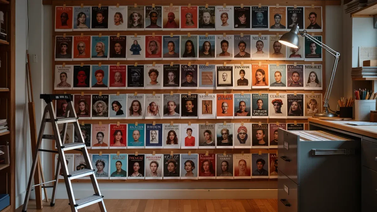
Spend an hour screenshotting the top twenty covers in your exact category and lay them in a grid; the pattern will shout. Cozy mystery leans warm and illustrated; epic fantasy favors emblem art and vast vistas with metallic type; contemporary romance pairs illustrated couples with breezy lettering; business nonfiction runs big-idea typography over a single clean concept. These conventions are not artistic cowardice — they are the fastest communication channel you own, and fighting them means paying for reader confusion. Break the pattern only when you can name what the deviation signals and why your book is genuinely the exception. A cover that whispers the wrong genre collects the wrong readers, and the wrong readers leave the one-star reviews.
How do you brief a professional cover designer?
With comps, category, and constraints — not adjectives. Designers price against clarity, and the brief that works is short: five example covers from your category with notes on why, the exact store category you will list in, and your technical requirements. Here is the sequence:
- Collect five comp covers from your category's current top sellers.
- State genre, subgenre, one-sentence story hook, and the store category.
- Specify deliverables: e-book front cover at 2,560 x 1,600 pixels, JPEG, plus layered source files.
- Agree revision rounds and deadlines in writing before any deposit.
- Ask for thumbnail-size proofs as part of the first review, not just full-size art.
The layered source file matters more than authors expect: without it, changing a subtitle for a relaunch means paying for a full rebuild. Premade covers — designer templates sold once and personalized — cost a fraction of custom work and suit series launch budgets; custom becomes worth it when the book is a business rather than a bet.
What rights do you need for images and fonts?
Commercial licenses that explicitly cover e-book distribution and promotional use, in writing. A standard stock photo license often does; a free-for-personal-use font never does. Cover art qualifies for copyright protection like any other creative work, and the basics are documented by copyright basics at the U.S. Copyright Office — what matters commercially is your license chain, not your registration.
Three habits keep you safe: buy fonts and images from established marketplaces that state the license plainly; keep the license receipts in a folder with the cover files, because platforms occasionally ask; and treat AI-generated art with extra care — marketplace and store policies on it were still evolving as of early 2026, so confirm what your tool permits before the art carries your title. A takedown notice two weeks after launch costs more than any font ever will.
Frequently asked questions about e-book covers
What size should an e-book cover be?
Per KDP's guidelines, use a ratio of 1.6:1, at least 1,000 pixels on the longest side, with 2,560 x 1,600 pixels recommended, saved as JPEG or TIFF. Other stores' specifications sit in the same neighborhood, so a file built to KDP's recommendation clears everywhere.
Are design tools like Canva good enough?
For simple genre-clean covers, yes — the tool is rarely the bottleneck; type weight, contrast, and imagery are. The risk is template sameness: if the store's category page is full of the same layout, your cover disappears. Whichever tool you use, judge the result at thumbnail size.
How much do premade covers cost compared to custom?
Premades typically run a fraction of custom pricing, per marketplace listings — you buy a finished design, supply title and name, and receive the personalized files. Custom work prices the designer's reading of your brief and comps. Start premade if the budget is tight; go custom when the series earns enough to reinvest.
Do I need a different cover for the print edition?
Yes. Print needs a full wrap — front, spine, and back with barcode space — sized to your trim and page count, while the e-book uses the front alone. Design the front first so it works as a thumbnail, then commission the wrap as an extension of it, not a separate project.