Typography, navigation, and honest conversion — a well-made e-book disappears so the story can show up. About three in ten U.S. adults read e-books, per the Pew Research Center's 2022 report on the prior year's survey, and nearly all of them have suffered a bad file without knowing whom to blame. Your device is innocent. The file is guilty.
The strange thing about e-book craft is that readers feel it constantly but name it rarely. We say a book was hard to get into when the real culprit was missing paragraph breaks, or that we were too tired to focus when the line spacing was fighting us. Here is what to actually look for.
How Can You Judge an E-Book Before Buying?
With the free sample and ninety seconds. Every major store lets you download an opening chunk before paying, and the opening is where bad files betray themselves first. Run five checks, in order; a file that fails the first two rarely recovers by chapter three.
- Table of contents. Open it from inside the book. Every chapter should be tappable and should land on the right page, not near it.
- Paragraph rhythm. Indents should be consistent and automatic — not fake-indented with spaces, which shatters the moment you enlarge the font.
- Punctuation. Real quotation marks and em dashes, no double spaces after periods, no stray characters where an accented name used to be.
- Scene breaks. Section breaks should appear as intended marks, not as five blank lines or, worse, nothing at all.
- Notes and extras. Tap a footnote number. If nothing happens, you are holding a print layout that was poured, not converted.
Publishers fix reported errors more often than readers assume — files are quietly updated, and your copy usually refreshes without ceremony. But sampling prevents the disappointment in the first place, and prevention beats a support ticket.
What Does Good E-Book Typography Actually Look Like?
It looks like nothing. Good e-book typography means the publisher styled the text once, structurally, and then let your device do its job — your fonts, your size, your screen. Bad typography means someone tried to control the page that was never a page, hard-coding what should flow.
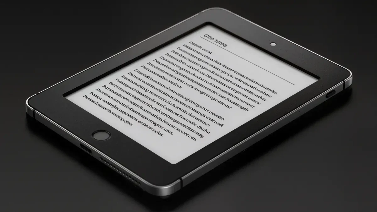
Reflowable text is the core bargain of e-reading: the same file serves a phone, a six-inch e-reader, and a large-print tablet. The publisher's job is structure — heading levels, proper paragraph styles, real italics rather than underlines, em dashes instead of double hyphens, hyphenation left to the reading system rather than baked in line by line. When that is done well, you read faster and blink less; when it is done badly, every page asks you to do small, invisible work.
The tell is what happens at the edges of your settings. Enlarge the font on a well-made book and nothing breaks: indents stay proportional, dialogue stays distinguishable, the scene break survives. Enlarge it on a lazy conversion and the layout panics — first lines drift to mid-page, chapter titles collide with text, and a poem turns into prose. Files are tested, or they are not. The sample shows you which.
Why Do Footnotes and Tables Break in E-Books?
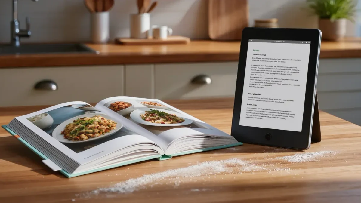
Because conversion pipelines flatten structure. A print footnote sits at the foot of the page; a raw conversion dumps every note at the back of the book with dead numbering, and a squeezed table becomes a smudge of ten-point regret. Good producers rebuild these as linked, navigable structures instead of pouring them flat.
Done properly, footnotes become tappable and return you to the sentence you left — some reading systems even show them as pop-ups, which is genuinely better than print. Tables get rethought: wide ones are rotated, split, or converted to lists that survive a phone screen. Poetry and code get their own non-flowing treatment so line breaks mean something again.
Scholarly and reference books suffer most, which is why serious academic publishers maintain dedicated digital-production teams and why a well-converted annotated edition can justify its price. The words may be identical to the print run; the file is a different artifact, and pretending otherwise is where quality dies.
Who Is Responsible — the Publisher or the Store?
The publisher. Stores accept and display the files as delivered; the typography, navigation, and conversion quality were decided upstream. Blaming your e-reader for a broken table of contents is like blaming the bookstore shelf for a missing index.
There are real standards, and they are public. The Library of Congress's Recommended Formats Statement lays out preferred technical characteristics for e-books — open, reflowable, feature-complete files — precisely because badly built digital books are a preservation problem, not just a reading one. Publishers that follow such guidance produce files that age well across devices and apps.
In practice, quality tracks workflows, not budgets. Some of the cleanest files come from small presses with one meticulous production manager; some of the worst come from converting a backlist of hundreds of titles on deadline. Genre imprints that publish weekly tend to have conversion down to muscle memory. Reissues of older classics vary wildly — which is why the sample check from the top of this article applies double to any book first published before 2012.
Frequently Asked Questions About E-Book Quality
Do e-books have typos?
Yes — sometimes from scanning the print edition, sometimes from a rushed conversion. The saving grace is that files are patchable: publishers push corrected versions, and stores usually replace your copy on the next sync. Reporting errors through the store's feedback link genuinely helps trigger that. Print runs stay wrong forever.
Why does my e-book look different on two devices?
By design. A reflowable e-book is instructions, not pages: your device chooses fonts, margins, and line breaks. The publisher controls structure; the screen controls appearance. If a book looks broken on several devices, though, the file — not the hardware — is the common factor.
Are expensive e-books better made?
Not reliably. Price reflects licensing, demand, and marketing budgets; production care is a separate virtue that shows up on both $2.99 novellas and $25 scholarly editions. Judge the sample, not the sticker. The best typeset book you own may be the cheapest one.
Can I fix a badly formatted e-book myself?
Only partly. Reader settings — font, size, margins, line spacing — soften many flaws, and side-loaded personal documents can be re-converted with free tools. Store-purchased files cannot be edited. For anything you paid for with real expectations, return it if the store allows; refunds are the clearest feedback signal publishers receive.